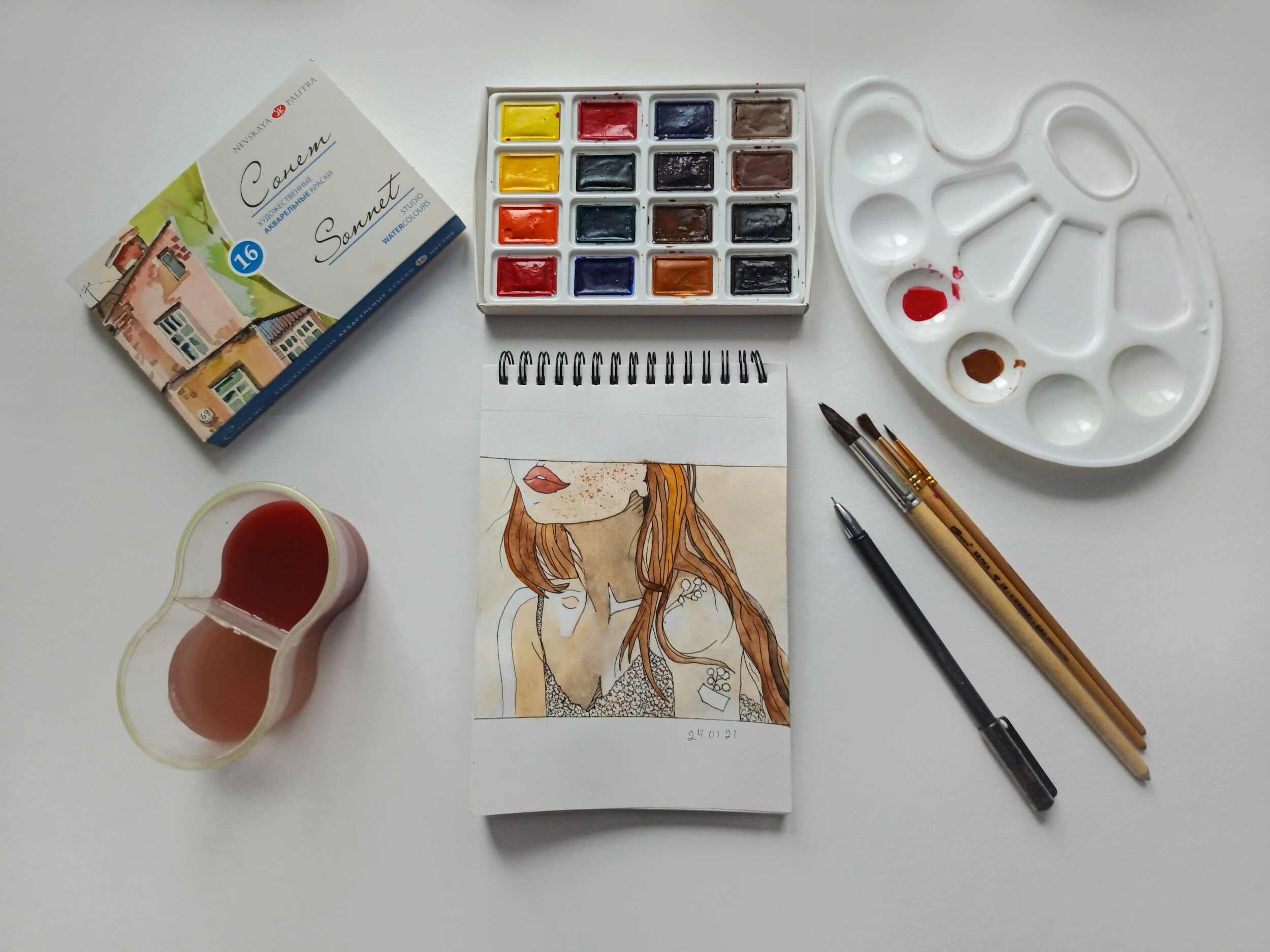
Creative Palette
One of my most vivid memories of being sick as a child is sipping ginger ale through a straw on the couch while watching Bob Ross. Man, that guy was great, wasn’t he? He made the process look so joyful, so playful. His voice as he soothingly talked through his color choices, the sound of his fan brush against the pallet, the orderly way he lined up his brushes, all of it simultaneously calmed and engaged me.
I’d love to invite you to expand your own creative palette using color as a point of inspiration for finding new stories to explore in your own life. Though this exercise will certainly generate new writing ideas, I’d like you to access your inner-Bob Ross, and enjoy the process. His happy little trees, as gorgeous as they were, seemed to evoke something like sadness in him once they were no longer in formation. So let’s roll up our sleeves and play today. Let’s see what takes shape.
EMOTIONAL COLOR WHEEL

Credit: Getty Images
Take a look at this color wheel and think about what emotion is tied to each one. Jot down a few of the shades you notice and name the emotions they evoke in you. Allow yourself to push further to describe more fully the range of emotions one particular color evokes.
THE ART OF NOTICING
Now, take a long, contemplative look at this painting by Makoto Fujimura. What colors did you notice first in this painting? What colors took longer to capture your attention? What shapes and textures stood out to you?
The art of noticing is part of the creative process. The art of noticing what you are noticing is how you teach yourself craft.
Let’s unpack this quote from Gretchen Rubin together:
“Color influences us, whether we’re aware of it or not. It’s a ubiquitous, conspicuous aspect of our world, but it’s unstable and hard to describe. Art can’t capture it; philosophy can’t make up its mind; science is unsatisfying; popular culture overstates.
I’m very absent-minded, and I’m usually walking around distracted by my own thoughts. By training myself to look at color, really to see it, I’m more able to engage with the world around me. It makes me feel more awake, more alive to the beauty of everything around me – the bright orange of a traffic cone against gray asphalt! Gorgeous.”
—Gretchen Rubin
By training the eye to notice color in our surroundings, we can train our mind to pay closer attention. I love that! And for this next exercise, I’ll be inviting you to notice color in your everyday life. You’ll need to have access to the photo gallery on your phone, so take a moment to bookmark this page so that you can easily return to it after viewing your photos. Ready? Okay!
COLOR SCROLL
One at a time, read the colors below and scroll through your photos until you find an image that features the color. Then, open the picture and write down the first three things that come to mind.
Green
Black
Pink
This is a wonderfully accessible writing prompt that’s always available to you. If you’re in a writing rut, pick a color, scroll your photos, and start writing your initial thoughts based on the photo you chose.
My search for “green” led me to a picture of my son washing paint off of his hands at the bathroom sink, and I jotted down the word “fastidious,” which had never had a truer meaning to me until caring for this little boy who abhors glitter, uses a hand towel to turn the sink faucet off (“Because my hands were dirty when I touched it a second ago, Mom!”), and will pause any creative project to clean a stray spot of paint off of him. He just can’t bear it. This is juxtaposed with his older sister, who began every single day at preschool by calmly painting the palm of her hand, the back of her hand, and all the way up her arm. It seemed to soothe her. After this ritual, she’d wash up and settle into blocks or playdough. Even now, at age eight, she still loves to paint her face, my face, anyone’s face… and Hey! Look! I’m writing! See what I mean?
YOU ARE NOT A BRAND
From the marketing world, we’ve learned that our audience wants to have a clear idea of what they can expect from us. “A niche is nice. Stick to a consistent color palette.” There’s nothing wrong with this thinking as part of our public-facing creative work, and refining the aesthetic of our blog, our wardrobe, or our home can even be part of the fun. But do you know when to turn off the part of your brain that is worried about viewer experience?
Think about it for a second. Is there a creative practice or “rule” you’ve been told that may be getting in the way of your process and keeping you from the joy of watching your art take shape, in the way of our man, Bob Ross?
Look around you at the default colors in your own life: what you wear, home decor, brand colors (if you have them). What would it look like to branch out? How could you explore the nuance of your preferred palette by playing with texture, opacity, or contrast? Similarly, if your writing often captures one particular mood or topic, how could you branch out into new territory?
MORE IDEAS FOR EXPANDING YOUR CREATIVE PALETTE
Keep a tub of play dough at your desk and take it out when you’re stuck or struggling to get going.
Make a playlist inspired by a color. Linked with the Emotional Color Palette exercise above, this playlist can serve to create a certain mood for yourself, which can be helpful for your creative process.
Create a color wheel-inspired snack plate with your kids and begin a conversation about how each color tastes. The beauty of color as a source of inspiration is our varied perceptions and connections.
This picture book is a family favorite to explore the world of color (including unique names for distinct shades of each color) and mostly lives in my office for a quick dose of inspiration.